Art in Advertisements
Art in Advertisements
Sometimes advertisements stay with us for a long time. I always remembered a particular billboard that I used to see because of the art used and how it was so simple and yet it aired so well with the message trying to get across. As someone that's interested in not only the art behind advertising, but the psychology of it too, I decided that I'd look at some advertisements I remember seeing throughout my life.
This billboard can be spotted locally and has been noted as good chuckle with a lot of my family and friends. The message is crisp and simple, but effective nonetheless. This general sort of minimalist theme is something I tend to like and it shows how much advertising has changed over the past few decades.
Just a comparison to an image of a 1950's advertisement shows how things have changed.
Looking at this we see not only the beautiful pin up art but what I'm interested in is the long paragraphs of text. This type of advertising would never work in the modern age (not only due to sexism) but because everyone wants something quick and easy to remember that also isn't so simple that you forget about it.
This other ad that I saw is placed in a subway and is advertising funeral services. I love the dark humor as well as the minimalist design.

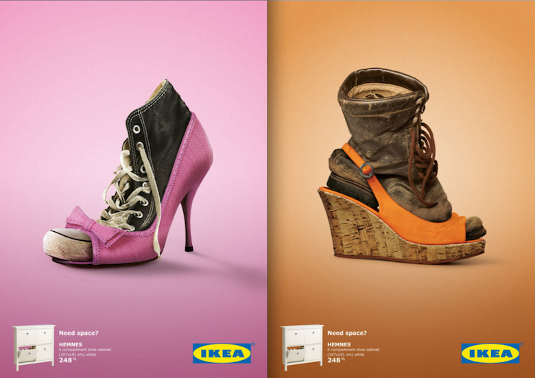
This color scheme of the pink and orange is something I really like. again this is another simple but pleasing to the eye design.
Overall my look at new advertisements shows that they either tend to go with lots of bright colors like reds and yellows, or they are monochrome. This idea is interesting to me since they seem to be totally different. Modern ads are also not cluttered, they have a clear main focus and they want their product to stand out so anything else that may be distracting is removed. I do have an interest in marketing so I'm glad I got to look at these ads because it may help me in the future.
Work Log: began making small realistic details and texturing objects this week


Comments
Post a Comment