Use of Color in Fantasy Settings
Use of Color in Fantasy Settings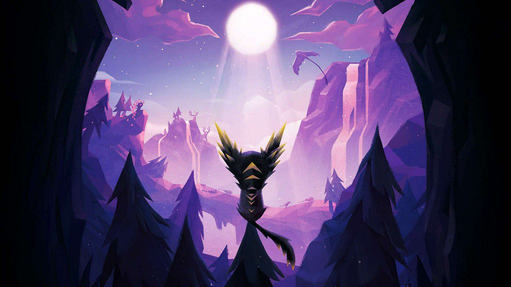
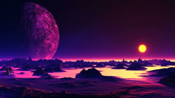


The type of whimsical feeling these types of scenes portray is something I am looking to achieve in my own art, so I studied a few different images that gave me an aesthetic i was looking to achieve in some of my art. After looking at some of the similarities in these images I recognized the color palette I was trying to achieve. In all of these pictures the main colors used are blue tones and purple tones with hints of gold or orange as an accent color. Since I have chosen my theme and focus this year to be fantasy with some elements of the sacred realm I feel that this kind of color palette will lend itself well to that general idea and bring some cohesive elements to what I'll be working on.


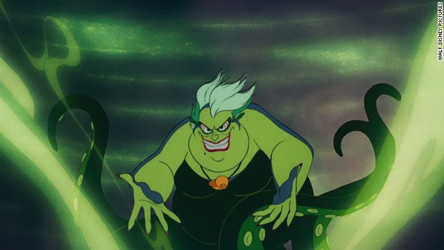 Other than the Use of these colors in fantasy scenes, I have found that when dealing with something typically morally darker the colors green and red seem to be used very frequently. This makes sense to me since red can be associated with a hellscape, blood, or other grotesque things, the use of green baffled me a bit. Since green to me is associated with peace and nature, I wondered why it was frequently used as a way to show something unsettling. I think the use of green in these can be attributed to the unexpectedness of it in a setting that isn't nature inspired, giving it an unexpected, bold place in the art.
Keeping in mind these color palettes and they feelings they bring to the viewers I will try to incorporate them into the pieces I will be creating in the future.
- Work Log -
Tuesday: TV studio demonstration
Wednesday: look into design of robes and cloaks that I could potentially use for my character's garments
Thursday: Begin creating Character's clothing
Friday: Continue modifying the character's cloak
Comments
Post a Comment